Born for Street: Design Story of Moca
Since 2014 when I first started photography with a proper camera, so far I’ve used a range of cameras and lenses, each camera has its pros and cons for street photography, obviously it’s difficult to design a modern camera that suits everyone’s need, but still, there’s always something missing for me no matter what gear I use, so I came up with the idea of making a camera app for street photography.
Compared to dedicated cameras, smartphone cameras have two major advantages:
- Smartphones are more socially acceptable. We can pick the best camera for street photography, the one that’s light, quiet, and small enough to not look like a professional photographer, but nonetheless, when you hold the camera and try to get close to people, they still recognize that as a camera and interpret that as you would take a photo of them using that camera for some purposes.
- You are more likely to take a phone with you rather than a camera. By using your phone as your main camera for street photography, you carry less weight and more often. I read from somewhere that a photographer said “always wear a camera”, this is true even if you don’t take your camera as long as you have a phone with you and the phone has a camera on it.
On the other hand, the list of disadvantages of phone cameras is rather long:
- Control: the lack of physical controls on smartphones means they can never offer the same level of user experience as a dedicated camera.
- Function: the lack of photography functionalities on smartphones means they have less shooting envelop compared to a dedicated camera.
- Low Light: phone cameras still struggle to keep up with proper cameras at night, or in any low light situation.
- Lenses: lenses are fixed, even if there are multiple lenses on certain mobile devices.
- Battery: phone batteries are improving over time, but still not good for long time photography use.
The five items above are the main challenges for designing a camera app for street photography.
Name
Before going to the details, let me first explain its name. I’m currently located in Melbourne, which is a city full of cultures from different countries around the world, “Mo” is the first two letters from the Chinese pronunciation of Melbourne, and “Ca” is the first two letters of the word “camera”, now you get Moca. As a bonus, Moca sounds the same as the coffee mocha, which also echos the coffee culture of Melbourne.
Control
Now it comes to the details. The most important button for a camera is probably the shutter button, which is even the only button on certain old cameras. Smartphones have limited physical buttons, the home button, volume adjustment buttons, and the button to switch the phone on and off. Most user activities happen on the display with virtual controls. Some devices let you use volume buttons to take photo, the problem with this is the volume buttons are not calibrated as a proper shutter button, and people like to have protection case for their phones which either cover the volume buttons or expose the volume buttons but make them less protruding, in either case, the volume buttons become less easy to press and pressing them can easily introduce a shake which makes the photo blurred.
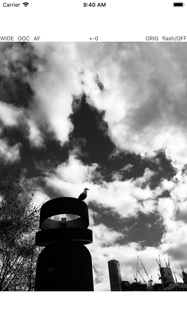
I’ve tried several camera apps on my phone and a common problem with them is that no matter where they place the shutter button, you do have to tap on that button to take photos, being a virtual button, you have no way to feel but have to look at the display to make sure you tap on the right spot, even if you get used to the app and remember where the button is, you still don’t get a physical feeling of the button which means there’s still the risk of missing a shot. Moca gets around this by making the whole screen tappable as a shutter button, this way you don’t have to look at the screen for shutter button; Actually, some street photographers prefer taking photos without looking at the viewfinder, you can do this now with Moca.

The next important thing for photography is to focus on the subject, modern cameras have the ability to focus automatically, and some cameras even have artificial intelligence to anticipate what you may want to focus on, legacy cameras without AF provide alternatives like focus ring and distance scale, which allows you to focus by zone. iPhones do have good enough AF, combined with small sensors, there’s a large depth of field, which means you don’t need to worry about missing focus. However, the speed of AF may not be ideal sometimes, and you may still wish to do some MF, say, for closeups, and even for street photography you may want to zone focus and forget about AF, this way it doesn’t take time to AF, which can be crucial for capturing the decisive moment.
And you still want some kind of nostalgia.

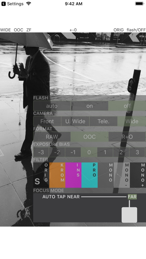
Moca provides a control that mimics legacy lens with the focus ring and focus tab, combined with AF. TF (Tap Focus) can be useful when you want to focus on a specific object where AF may not always focus on that object.
Function
On a dedicated camera, there are usually function buttons that you can assign different functions to, the most successful implementation of function buttons I’ve seen so far is on Panasonic cameras, they got it right, especially the logic of toggling between LCD and EVF while using function keys. In this regard, the challenge for a camera app is obviously the lack of physical buttons, the layout of virtual buttons displayed on screen can be difficult to design: fewer buttons mean fewer functions, or more navigations if a button takes you to another page of more buttons, more buttons provide more functions at the cost of a messy screen layout.
We often hear the saying like “simplistic yet not simple”, what does it mean for a camera app? From various design stories, we understand that street photographers prefer less distraction and sometimes even fewer functions so they can focus on one thing that is taking photos, without thinking about alternatives.
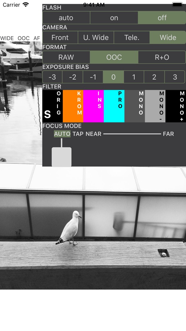
This is why Moca has the whole screen as a shutter button, and this is why Moca has a control panel that only provides essential settings, including photo format, flash, camera, exposure compensation, and filter. The controls are not displayed all over the screen at different edges or corners like some other camera apps, all settings in the app are grouped in a single control panel which can be summoned or removed by a simple vertical swipe.
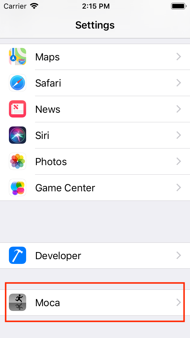
We’ve seen camera that have a hidden screen, and camera that doesn’t even have a screen, some people consider this as the purity of photography, this is the “simplistic” part, but for a camera app, where is the part that’s “yet not simple”? The answer resides in Settings. We’ve taken away features that you don’t often use and put them in the phone’s Settings page, this leaves only essential features available in the app.


Another thing worth mentioning is that Moca utilizes iPhone’s powerful gesture control for different functions, for example, long press on a point in live view will adjust exposure based on that point, the feature can be disabled; You can assign a function to horizontal swipe gesture; You can also turn on the pinch gesture so that you can adjust the border of live view. These feature can be disabled, I mention this because I’ve seen similar behaviours on cameras that do not get it right. Technically for a disabled gesture function I can either:
- Detect the gesture but do nothing if no function is assigned, or:
- Do not detect the gesture at all if no function is assigned to that gesture
Moca takes the second approach, the reason is always for the purpose of taking the decisive moment, imagine we have to detect multiple gestures:
- single tap: touch and lift of finger
- swipe: touch + swipe
- long press: touch and stay
- double tap: touch, lift, touch, lift, in a short period of time
All operations above start with finger touching the screen, the system has to wait a bit and figure out what action it is after your finger touching the screen, this creates a lag and leads to bad user experience.
I’ve used X-E3 and X100V, both of them have touch screen functions but none of them is smooth enough, someone reported this on DPReview and there’s a reply suggesting disabling the swipe function can make the touch function more smooth, which aligns with my theory that multiple gesture detections can make the operation laggy.

I’ve only included the classic filters built-in with iOS from a while back, as filter isn’t the main purpose of Moca, and people mostly use third party apps to process photos, so Moca is made to be simple by just having essential filter options.
For focus mode, I’ve refined and redesigned a few times and came up with the focus control in the end, it offers a focus tab and you can use it to switch between AF, TF as well as MF with distance. As soon as the focus tab moves, the control panel will have a semi-transparent background so that you can see what’s in focus when doing MF.

Low Light, battery and lenses
Due to the small sensor, there’s no good way to resolve low light noise - if you don’t want to rely on computational technology, battery life is also a problem, I’ll think more about it for the next update. Lenses are not really a problem even though iPhones have fixed camera, street photographers prefer prime lense and all iPhones should have at least the wide angle camera which is fine for street photography, some models even have telephotos and super wide angle cameras.
Free is Free
The last thing and probably the most important thing for your wallet, is the app is free on AppStore, here, free means free, not the kind of free where you can download but have to watch ads, which is also against our principle of simplicity. If you do want to support me, thank you, please give me a good rating on AppStore.
Hope you enjoy the app and please go to the streets and take photos. Peace!
